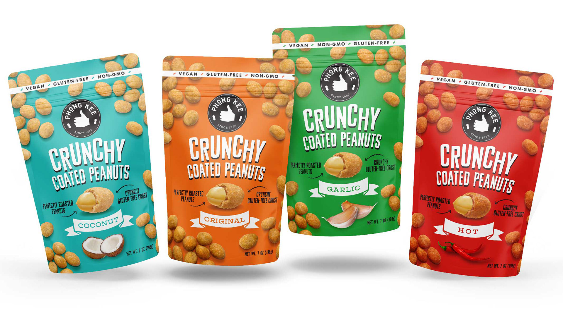

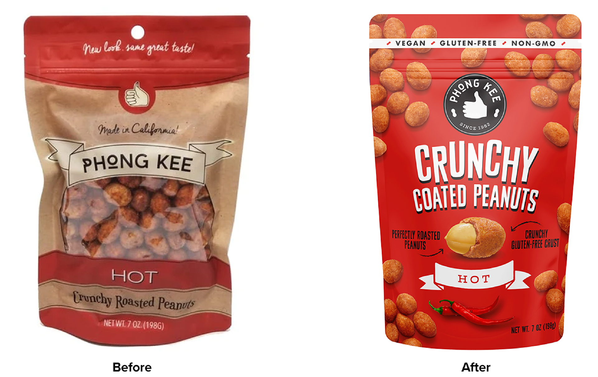
We revamped the logo and packaging design of Phong Kee's delicious range of crispy coated peanuts. We partnered with the talented folks at Smoketown to head up the Brand Strategy.
THE CHALLENGE
Phong Kee has been in business since 1982 but has been sold primarily in Asian grocery stores on the west coast. They wanted to expand the brand's reach into more conventional national grocery chains like Whole Foods and Kroger but were having trouble getting on the shelf with their old packaging. Also the product window wasn't appetizing for consumers because it wasn't clear what the product was.
THE SOLUTION
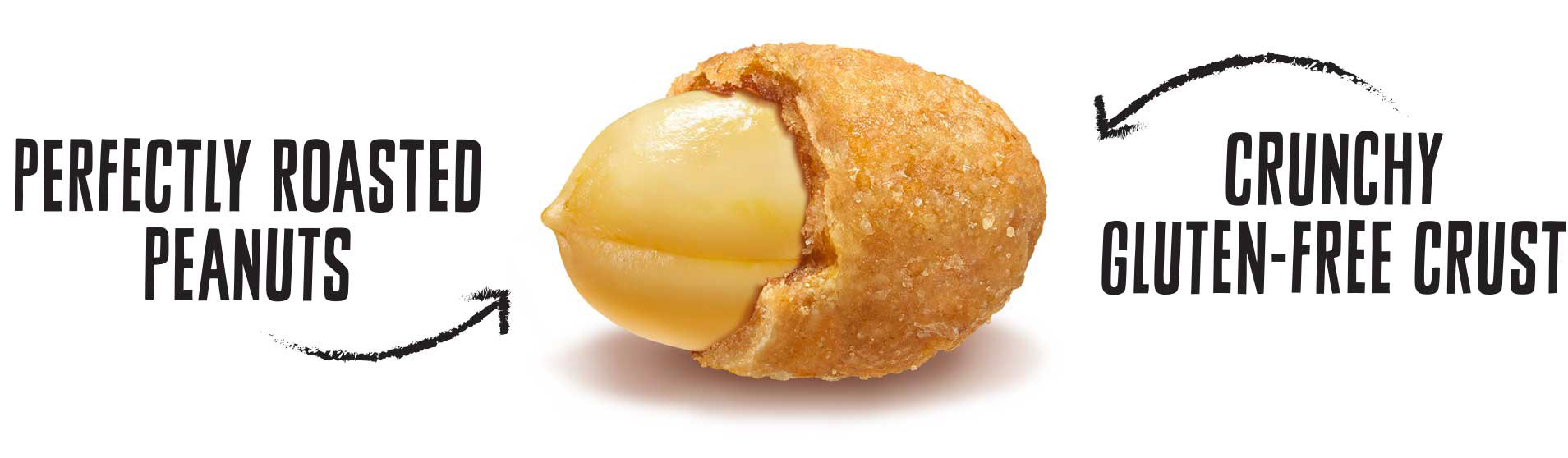
By incorporating vibrant colors and simplifying the packaging design architecture, while emphasizing the product's appetite appeal and health benefits we were able to make the packaging more bold and contemporary. We enhanced the product's appetite appeal by employing hyper-realistic product illustrations that showcase both the crunchy outer shell and the peanut inside.