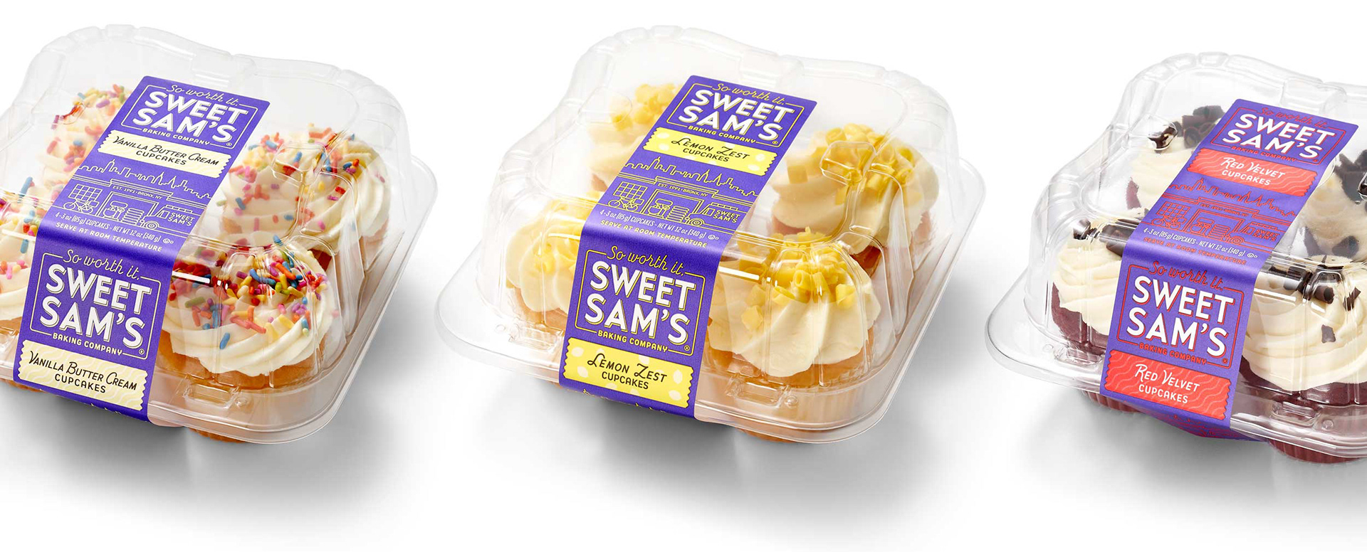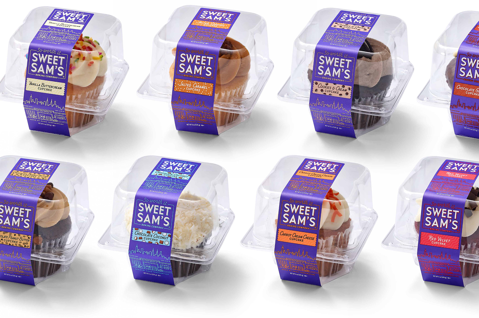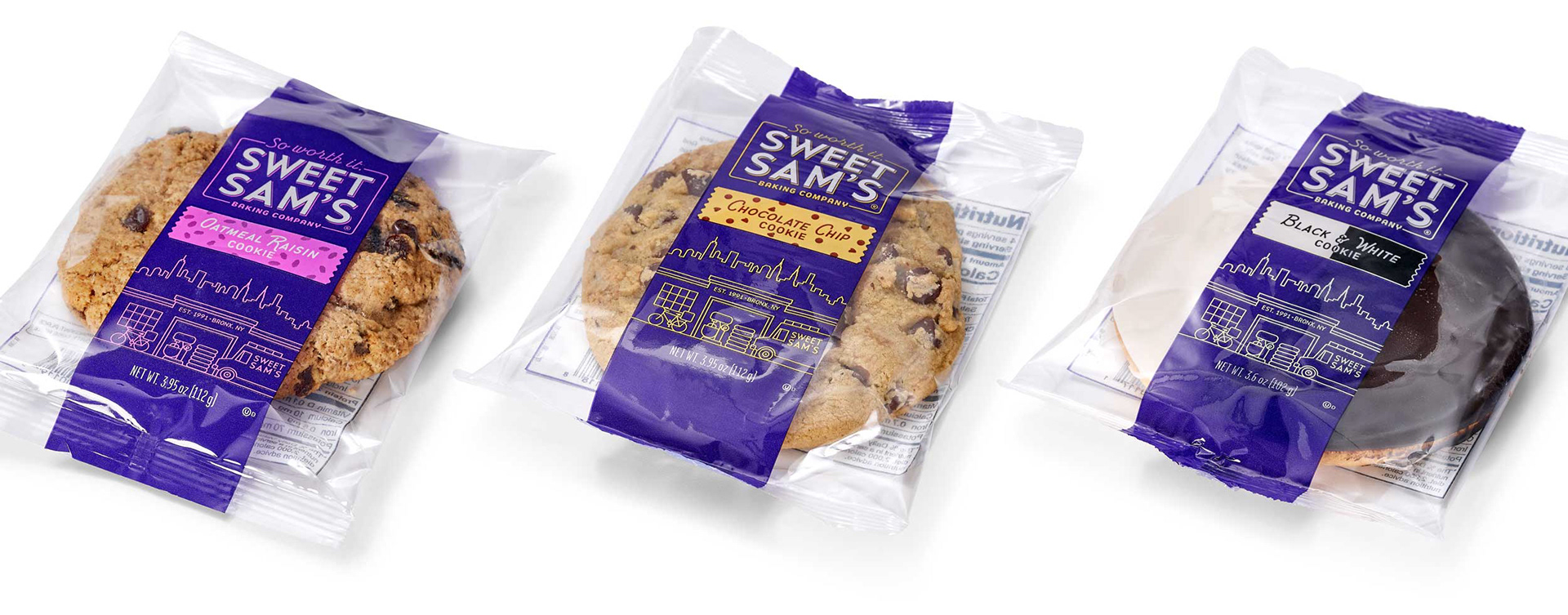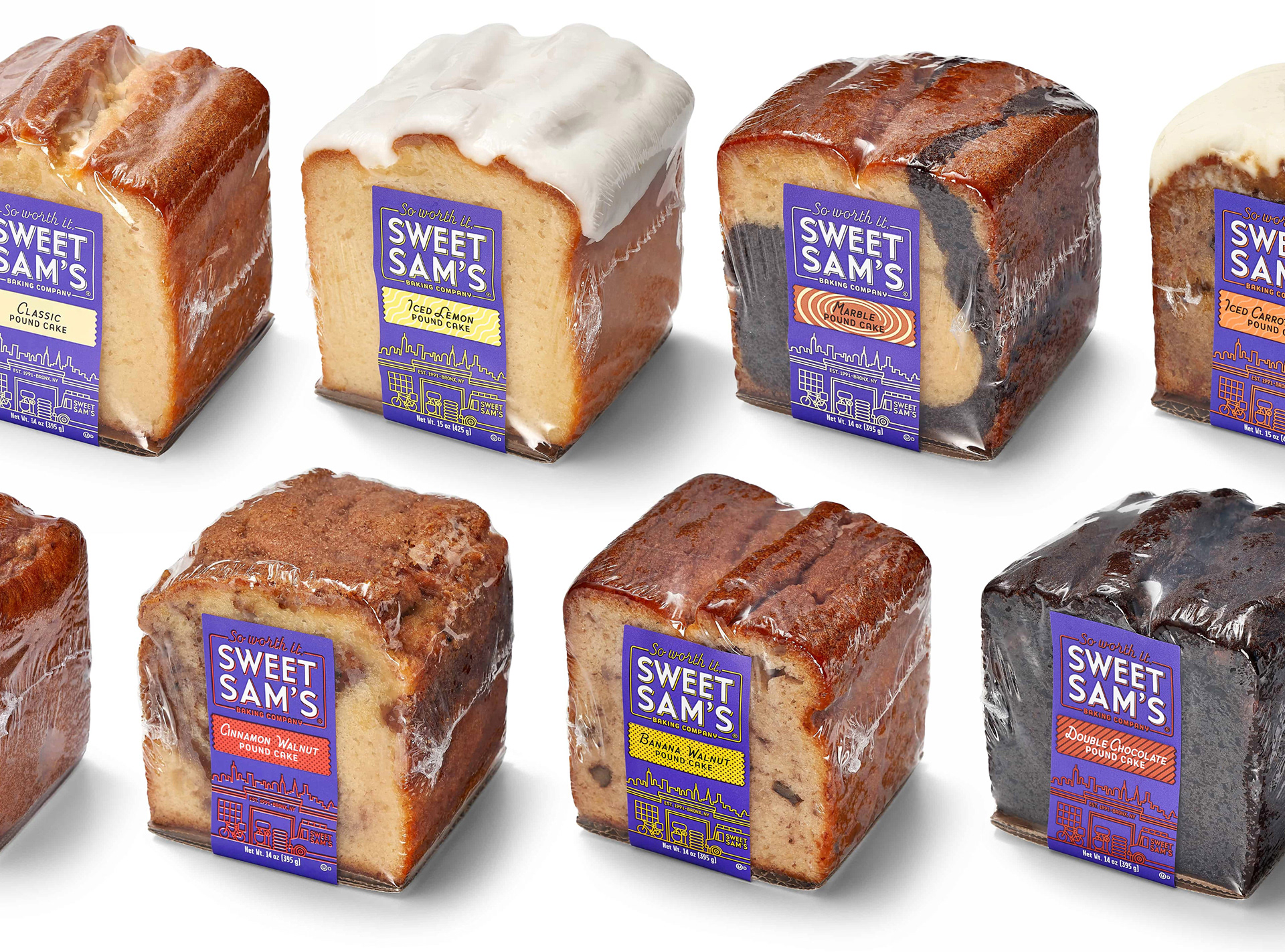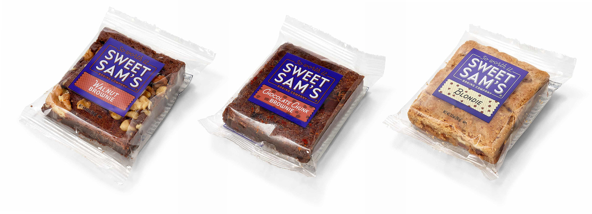

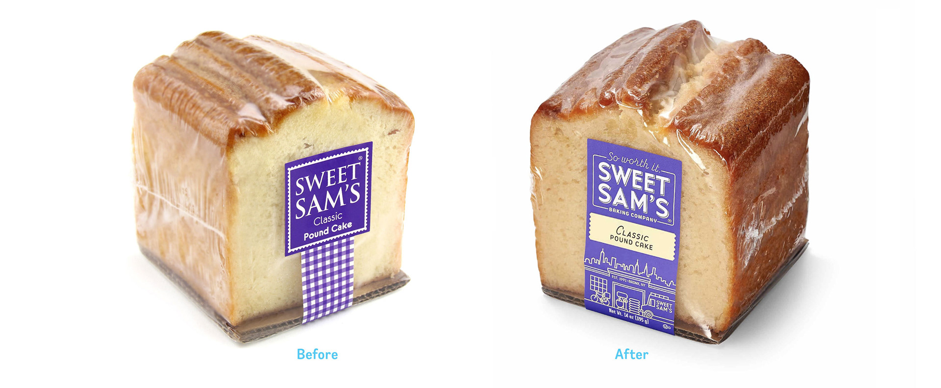
Sweet Sam's is a large Bronx-based, family run bakery with a commitment to quality. They enlisted GardenHaus to redesign their logo and packaging system that accommodates all 140+ SKUs.
The Challenge
Unlike their competitors, Sweets Sam's uses only the finest ingredients (like real butter!) in their iconic sweet treats. They needed to modernize their brand in a way that is still recognizable to their current customers while attracting a new younger generation of consumers. We also needed to come up with a flexible system that would work on a variety of different packaging types.
The solution
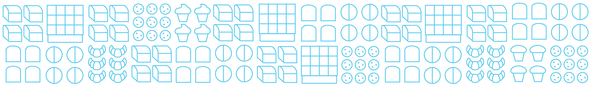
We kept the same violet color that their current customers look for and added simple line illustrations that speak to their Bronx heritage. We also added a color coded flavor banners embedded with fun illustrations that help with shopability and add more flavor appeal. We used a simple rectangular band that can be applied to all products types while allowing their products to shine.